Menlo College
A college website rebuilt around the paths people actually use.
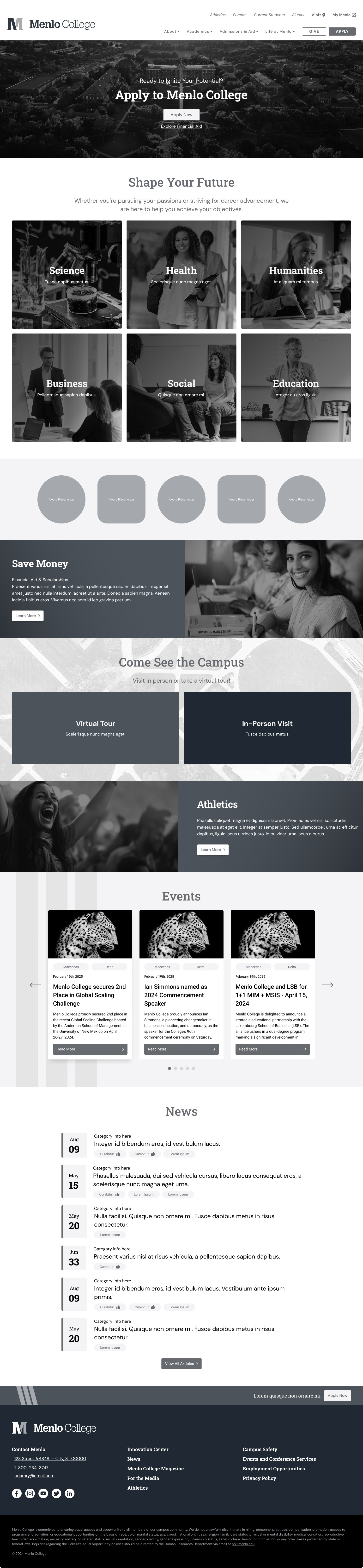
The old site made important paths harder to find than they needed to be. Apply, Visit, Give, program pages, admissions content, and mobile navigation all needed clearer structure. The rebuild focused on helping visitors get where they were trying to go with less friction.
Initial issues
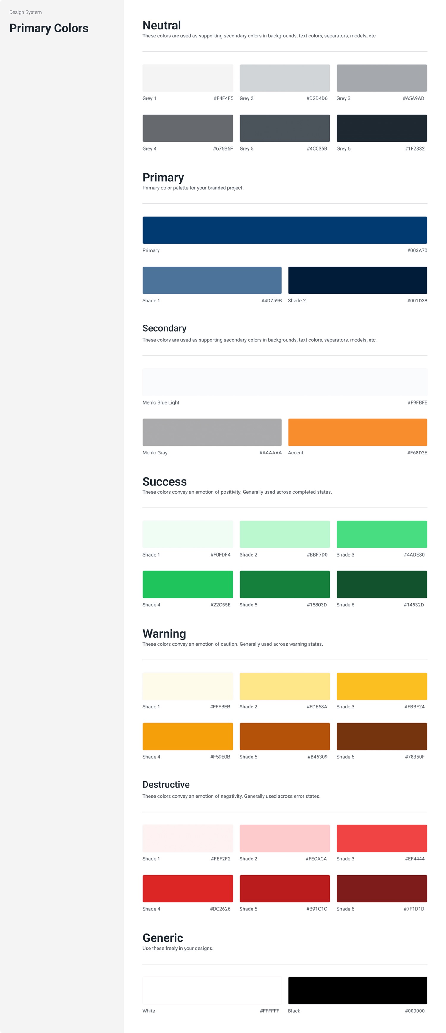
- No stable design system across pages
- Apply, Visit, and Give were too easy to miss
- Mobile pages were slow and awkward to use
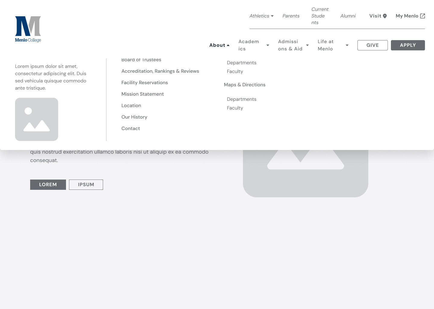
- The navigation did not clearly reflect the site's highest-priority paths
- Page structure was inconsistent, which hurt clarity and search visibility
Work completed
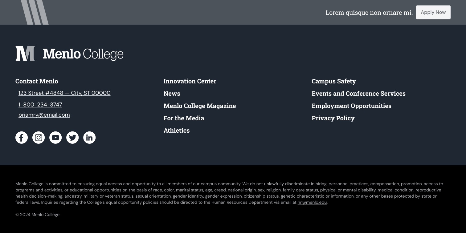
- Reworked the site structure and navigation around admissions, campus visits, giving, and program discovery
- Designed a responsive UI system in Figma
- Created reusable components and clear implementation notes
- Supported the move to a faster, easier-to-maintain WordPress build
- Added direct paths to the actions the college cared about most
- Built SEO fundamentals into templates and markup instead of treating them as a cleanup task
Results
- Clearer paths to admissions, visits, giving, and program content
- Improved page structure across desktop and mobile
- Stronger performance and maintainability after the rebuild
- Admissions staff reported that the site was easier to use and explain
Role
- UI and UX design
- Site structure and layout system
- Component documentation
- Client and developer coordination
What this demonstrates
- Information architecture work tied to real user paths: Apply, Visit, Give, admissions, and programs
- Responsive UI system design for a content-heavy institutional website
- Reusable component planning for a maintainable WordPress rebuild
- SEO-aware page structure built into templates and markup from the start
- Ability to translate stakeholder priorities into clearer navigation and page systems